Analytics
Our statistics...
For Our Data in Depth, Click Below

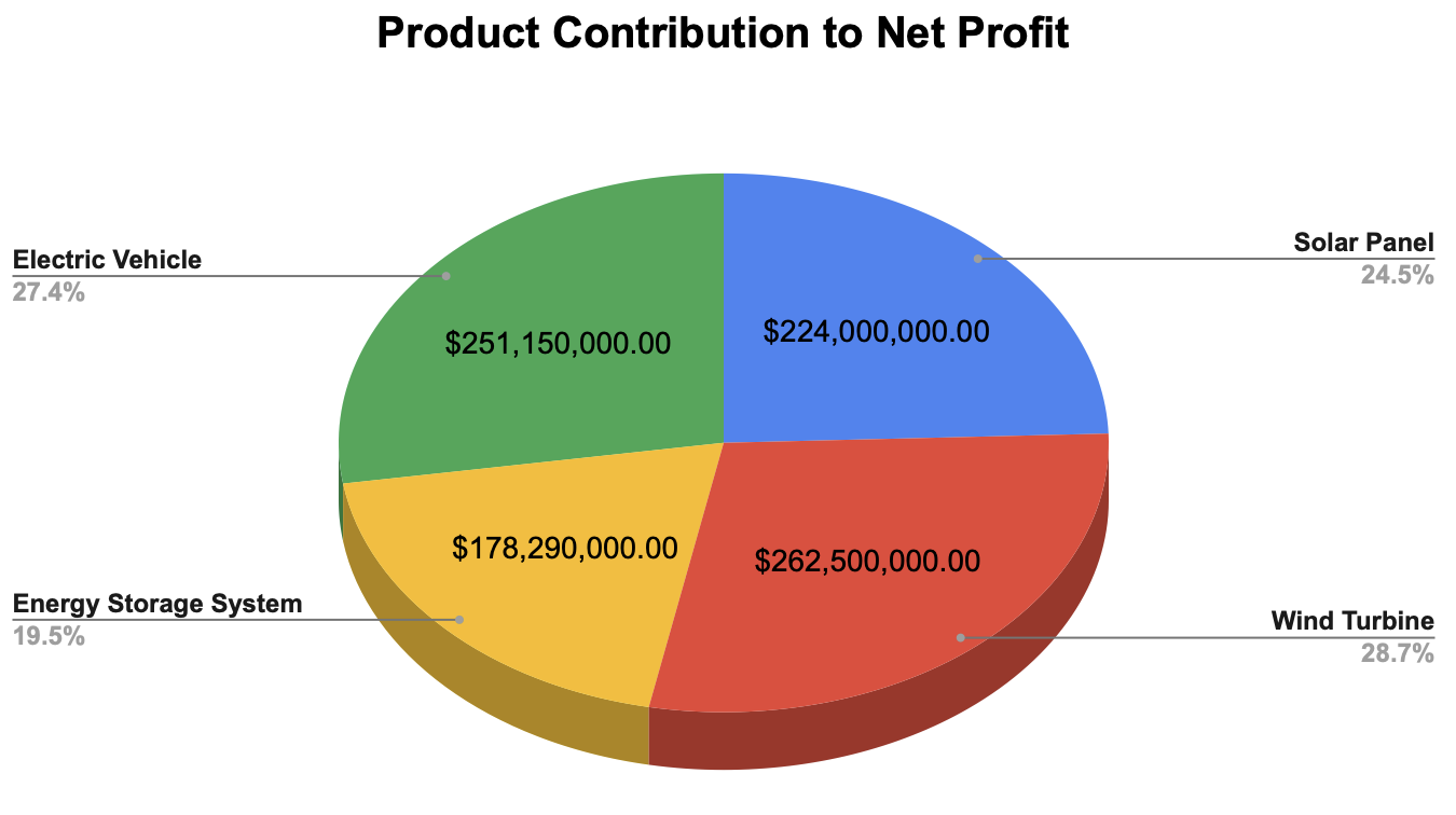
We take immense pride in the diverse range of products we offer, and we believe in providing a clear picture of their individual contributions to our overall financial success. To showcase this, we have created a chart that highlights the proportional breakdown of each product's profit in relation to our total net profit. The chart presents each product category as a separate slice, with the size of each slice reflecting the respective contribution to our overall net profit. By analysing this chart, we gain valuable insights into the profitability of each product category and can make data-driven decisions to drive our business forward. It allows us to identify which products are leading the way in generating profit and which may require further attention and development.

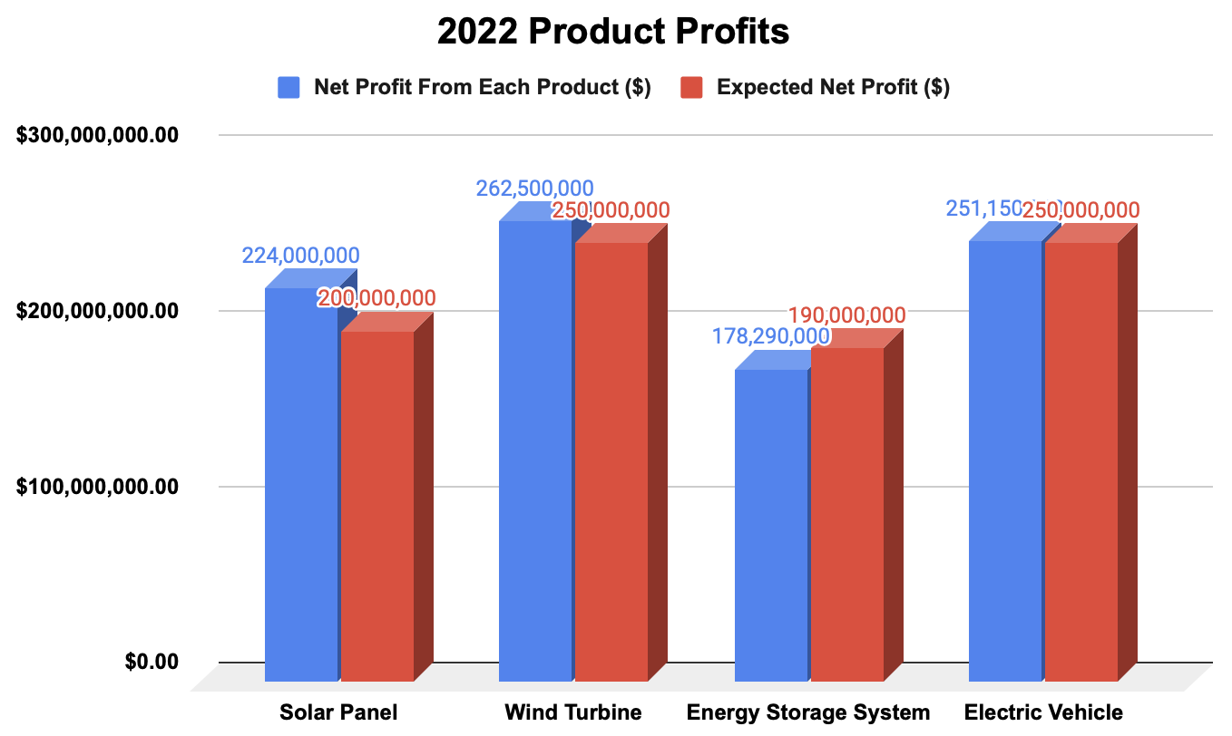
At our company, we are driven by a commitment to accuracy, forecasting, and measuring our performance against our goals. To provide a comprehensive view of how our products are performing relative to our expectations, we have created a graph that compares the actual net profit of each product to the expected net profit. Each product is represented by a separate column, with the height of the column reflecting the respective net profit. The x-axis of the graph represents the products we offer, including solar panels, wind turbines, electric vehicles, and energy storage systems. The y-axis represents the net profit in hundreds of millions. By comparing the actual net profit columns to the expected net profit line, we can assess the performance of each product category. When the actual net profit surpasses the expected net profit, it indicates that the product is exceeding our projections. Conversely, if the actual net profit falls below the expected net profit, it prompts us to analyse and address any potential issues or areas for improvement.

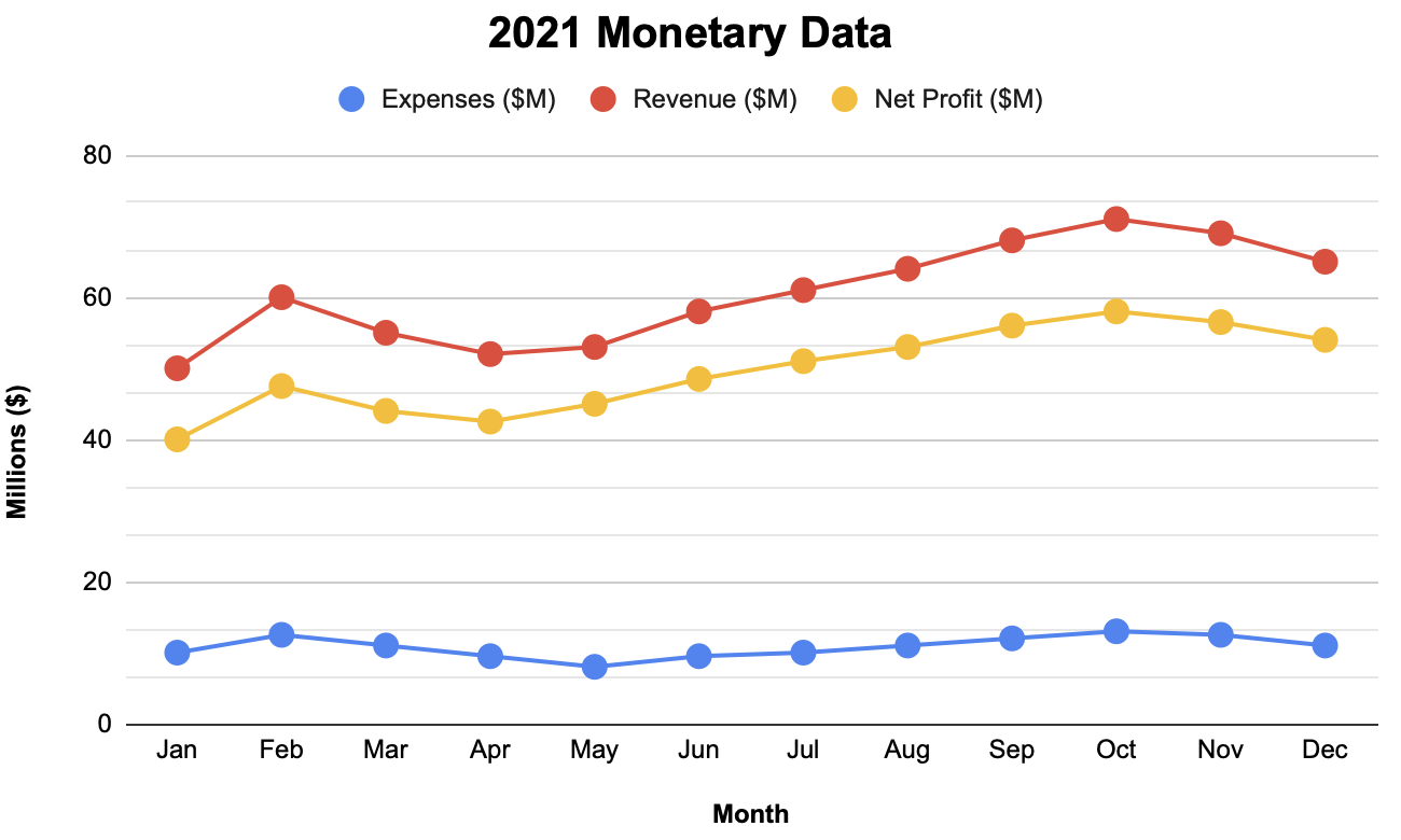
Our company believes in transparency and accountability when it comes to our financial performance. To provide a clear overview of our financial health, we have created a graph that illustrates the trends in our expenses, revenue, and net profit over time. By tracking the key metrics in the graph, we gain valuable insights into the financial trajectory of our business. By regularly monitoring this graph, we can make informed decisions, devise effective strategies, and ensure the sustainable growth of our company. It highlights our commitment to financial prudence, maximising revenue, and optimising our expenses to achieve a healthy and thriving business.
